
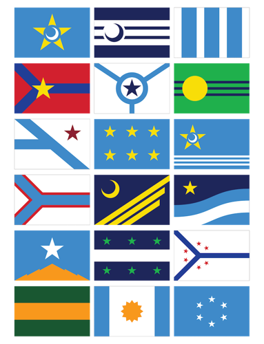


The finalists for a new Columbia flag.
The City of Columbia is looking to replace the old cotton-and-corn garnished flag it has been flying for more than a century.
The city’s efforts — spearheaded by One Columbia for Arts and History and the Columbia Design League — have been gestating since January. Residents were invited to come up with their own designs for the city’s next flag and more than 540 designs were submitted.
Out of those 540 entries, the North American Vexillological Association, an American and Canadian membership organization devoted to vexillology — the scientific and scholarly study of flags — recommended 18 finalists.
The public now has an opportunity to review those finalists and offer input via a public commenting period that will be open until July 10. The flags can be reviewed at colaflag.org. One Columbia’s Lee Snelgrove says more than 5,000 people have reviewed the flags in the week since the website went live.
According to officials at One Columbia, a panel of design experts convened by the Columbia Design League will evaluate the public comments for each finalist design, then deliberate and recommend one of the finalists as the city’s new official flag. The proposed flag would be presented to City Council this fall.
The designer of the winning flag will get a $2,000 prize.
The current city flag is not exactly iconic. Adopted in 1912, it’s blue with the city’s seal in the center. On the right side is a spray of cotton, and on the left side is a stalk of corn with full ears and a tasseled top. (Corn and cotton were the leading crops of the area at the time of the banner’s adoption.) The flag only flies at a few places in the city, including City Hall and the main fire station.
“There are probably not 10 people in the City of Columbia who know what’s on it,” City Councilman Howard Duvall said in January. “The only reason I know is because we looked at it during a meeting.”
When the panel ultimately determines the winning design, it will take guidance from a document called Good Flag, Bad Flag, which was compiled by flag expert Ted Kaye, of the North American Vexillological Association. Kaye met with leaders from the city, One Columbia and the Columbia Design League in advance of the current process to find a new flag.

The City of Columbia's current flag.
Among the key principles outlined by Kaye for a proper flag are simplicity, meaningful symbolism, two-to-three basic colors, no lettering or seals, and distinctiveness.
One of the main problems with the city’s current flag, according to flag experts, is that it has the city’s seal on it. Flag designers call that “seals on a bedsheet,” or “SOBs.”
When the finalists were announced June 15, the online reaction was swift — and largely negative. “Gosh, I sure hope they reconsider. These just look tacky and cold, quite the opposite of Columbia!!” was the first comment from a reader when Free Times posted the story on Facebook. Discourse went downhill from there.
Snelgrove says he has fielded a number of emails from people who aren’t crazy about the proposed flag designs.
“I think people are looking for something more than what a flag should be,” Snelgrove told Free Times. “They are thinking about this as branding, or a logo. They want it to try to represent everything in one, but flags don’t work like that. Flags are more like symbols that you add meaning to. … You want simple flags. I’m sort of surprised to see people [who were previously unaware of Columbia’s current flag] saying, ‘Oh, I see now we have one and I like the old one better.’
“But I’m glad that so many people actually are speaking up and showing their passion for wanting something that can represent Columbia well.”


